
Behold
product design
〰️
product design 〰️
Product: Behold (Interactive History App for an Art Gallery)
Role: UI/UX Designer
Duration: Aug-Sept 2022 (2 months)
Project Vision:
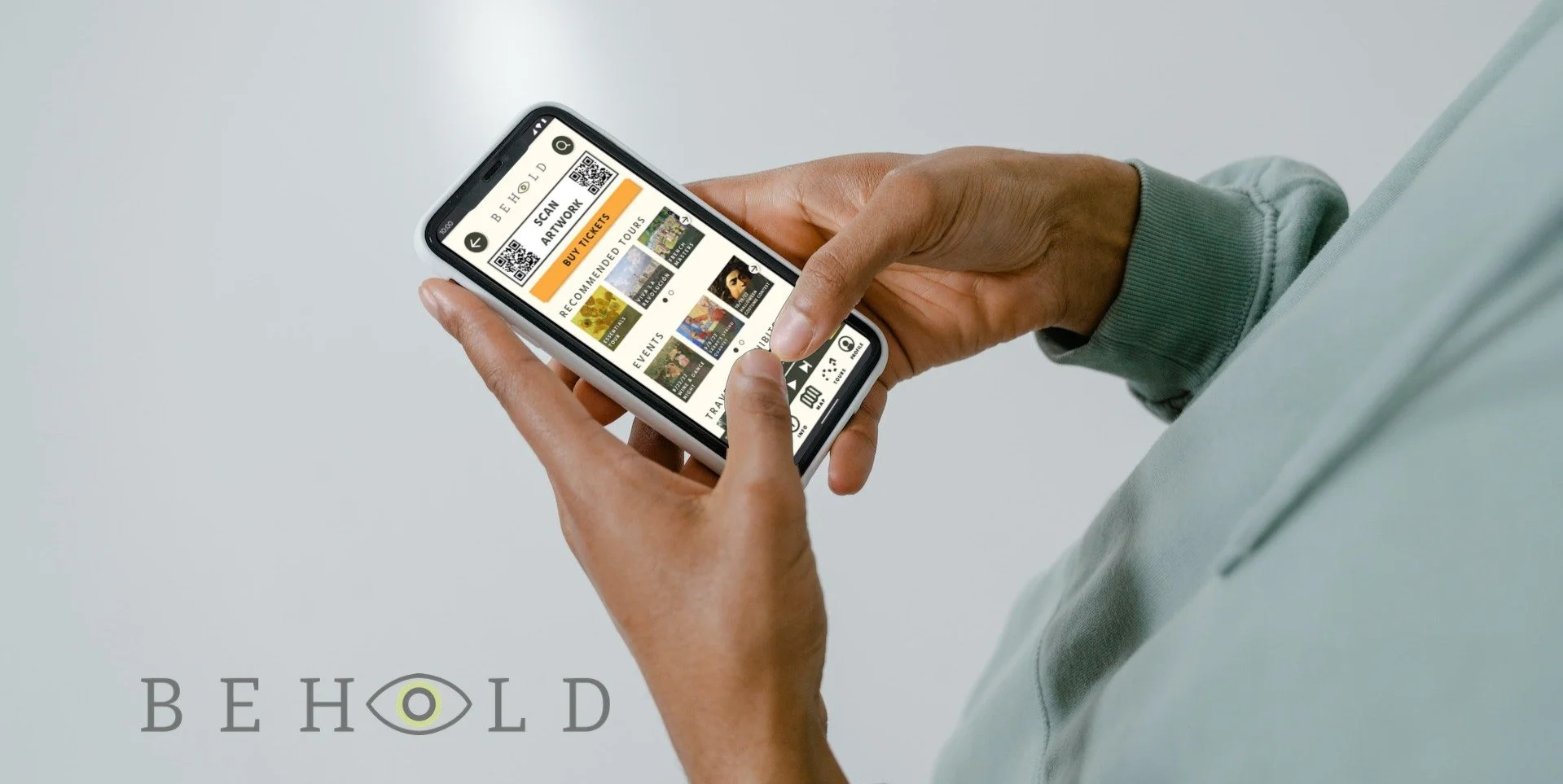
The eye of the beholder, in the palm of your hand.
While users love immersive museum experiences, they’re often overwhelmed by information and leave with a limited understanding of what they’ve viewed. My goal was to create an app that helps users of all ability levels easily find what they’re looking for and save relevant information for later review with a social tour journal feature.

Challenges:
Design a tool that helps users navigate a large museum environment.
Integrate a variety of search features to make locating and storing art history information easy.
Create opportunities for users to personalize and share their museum experience.
Kickoff
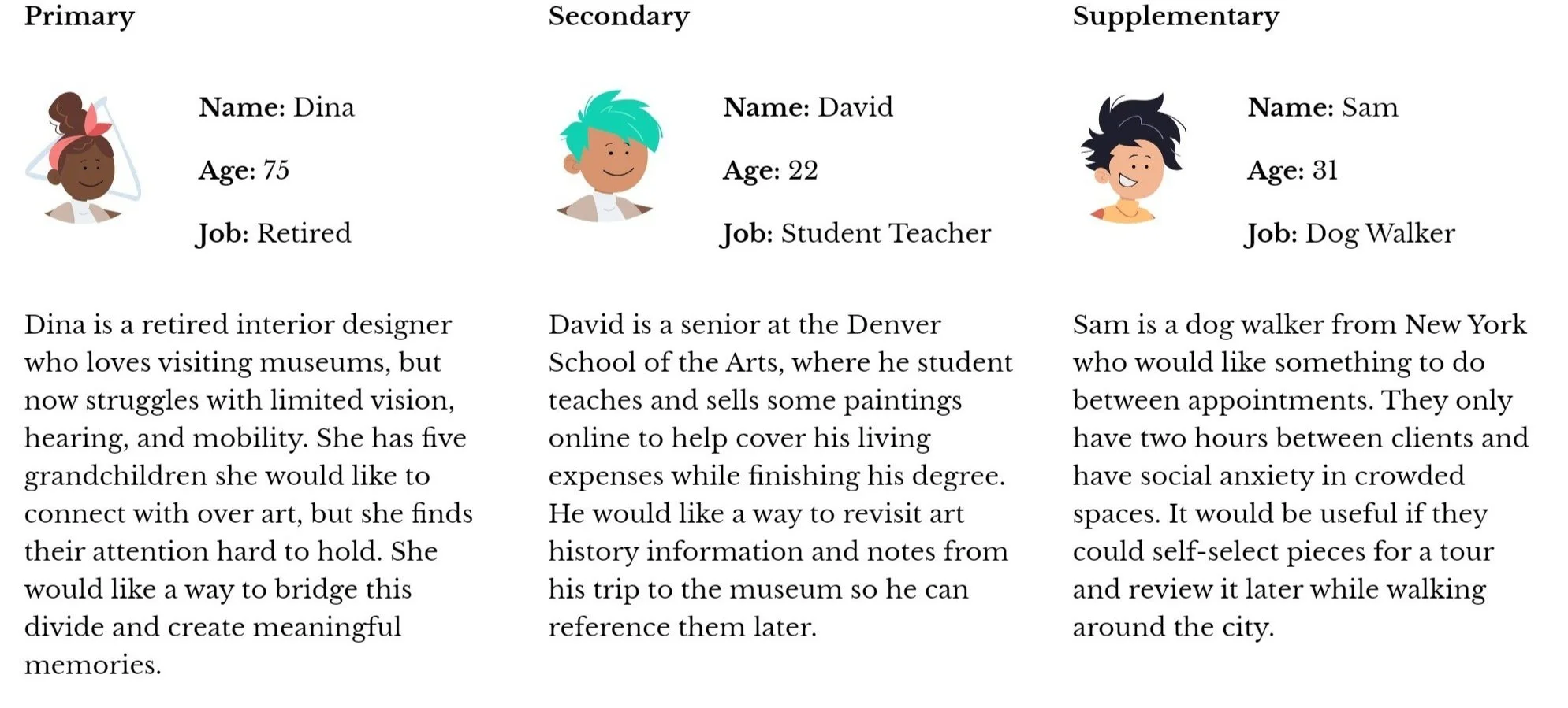
In this project, I began by trying to understand potential users with qualitative research methods which consisted of targeted interviews with a museum worker from the Art Institute Chicago and an elderly neighbor who frequents art museums. Using insights from these conversations and an audit of six direct and indirect competitors, I constructed user personas and journey maps to identify four key pain points.
Meet the Users
Competitive Analysis
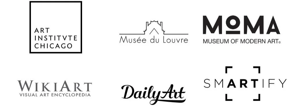
Before beginning my design, I took a detailed look at six competing applications. Three were designed for specific museums (Art Institute Chicago, MOMA, and The Lourve,) and the rest focused more generally on art history and custom tours.
Many features overlapped between competitors, but the main differences that I noticed were:
Easy vs. difficult to navigate
Clean vs. messy design
Limited vs. abundant content
Free vs. paywalled features
Pain Points
1
A large museum can be overwhelming, to the point where visitors feel as though they didn’t get enough time with any one piece.
2
Searching for information about a particular piece can be difficult, especially in crowds.
3
A trip to a museum with children can be stressful because of short attention spans.
4
Using mobile applications can be challenging for users with limited vision, hearing, and dexterity.
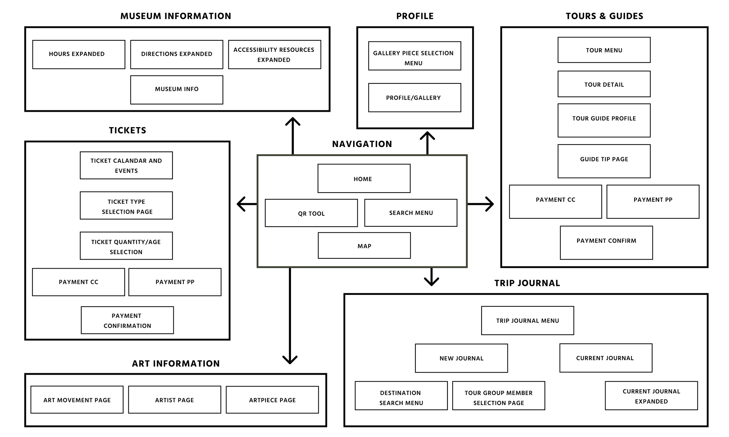
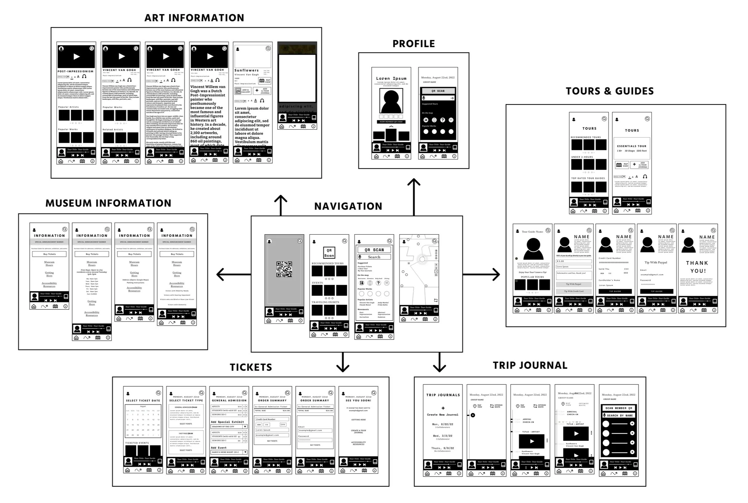
Sitemap
The app uses a matrix/database information architecture to take users through seven distinct flows designed to complete a variety of tasks:
Navigation
Profile
Museum Information
Tours and Guides
Ticket Selection and Checkout
Art Information
Trip Journal
Wireframes & Wireflow
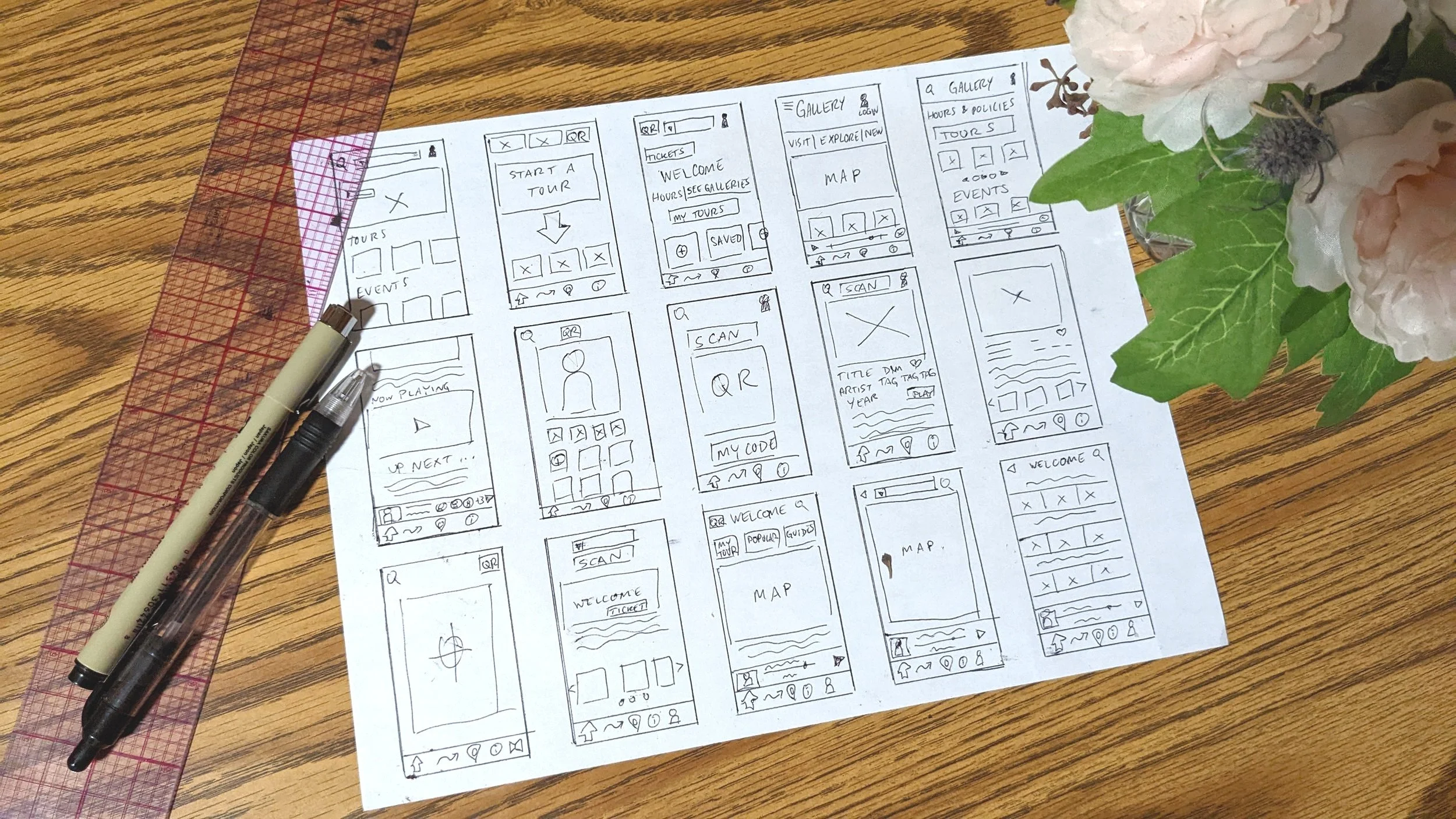
After sketching some quick paper wireframes, I constructed each user flow and started to think about how users could quickly navigate between them.
I decided to utilize a taskbar, top navigation icons, and a media player to make getting around a breeze.
Prototype & user testing
Next, I created a prototype from low-fidelity wireframes and conducted an unmoderated usability study.
Participants were asked to perform a number of critical tasks:
Purchase a specific ticket on the day of a given event.
Locate a specific painting and learn something about the person who created it.
Add a tour to your tour journal.
Tip your tour guide.
A follow-up survey was used to gather feedback and assess problem areas for my next design iteration.
I then refined my prototype from feedback and repeated the process.
Usability Study Conclusions
Vague labels & icons.
Similarities in the appearance of certain icons made navigation difficult for some users, and some button labels were confusingly worded or absent.
Confusing checkout process.
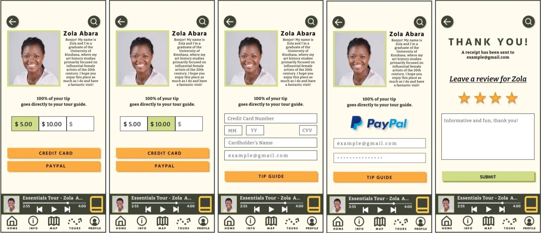
Users reported confusion when purchasing tickets and tipping tour guides. I determined that a confirmation page with an emailed receipt would make users feel more secure.
Complex gestures are unnecessarily difficult.
While swipe gestures are commonplace for mobile users, they were unfamiliar and unnecessarily difficult for some test users.
Poor navigation between map and tour journal.
Some users had difficulty understanding the function of the tour journal and the way it functions alongside the museum map.
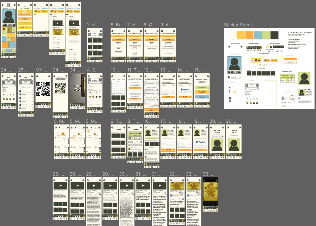
High-fidelity Mockups
Homepage before

Homepage after

Tip Flow Before
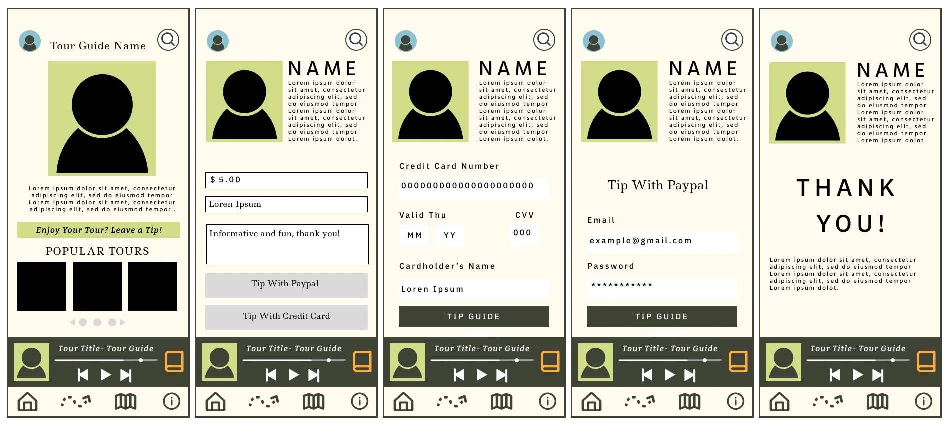
Tip Flow After
High-Fidelity Prototype
Challenge 1
Museums can be overwhelming, and guests often leave with a fleeting memories.
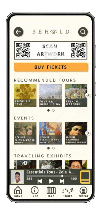
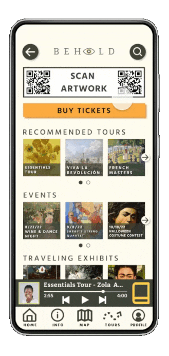
Behold features a Tour Journal feature that automatically stores images and supplemental material to revisit later.
Challenge 2
Finding information about a specific art piece can be difficult, especially in crowds.
The app features a QR Scanner, talk-to-type search, and pre-planned audio-visual tours that make finding information easy and automatic.
Challenge 3
In the digital age, users have developed shorter attention spans.
Children are especially likely to get bored in an art museum, so the app features a number of ways to interact, react, and customize their experience so families can better enjoy the museum together.
The profile page uses an AI-powered filter frame that lets users see their portrait rendered in a variety of artistic styles and an interactive wall where users can curate a gallery of their favorite pieces.

Challenge 4
Mobile applications can be difficult for users with limited vision, hearing, and dexterity.
Behold includes close-captioned audio tours with the option to enlarge text and tappable buttons for users who find certain complicated gestures difficult.
Style Guide


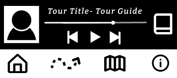
Task Bar

Buttons


QR Tool


Takeaways
As a frequent museum-goer and artist myself, this project was extremely gratifying. With more time and funding, I would love to bring this product to life for use in an actual museum or gallery.
This was my first time using the goal-directed design process, and I will definitely use it in future creative endeavors. Creating personas and conducting pointed research to guide my vision was a rewarding experience that certainly improved the final product.
Thank you for your time and be sure to check out the process for Behold’s creation below!