Burrow
Product design
〰️
Product design 〰️
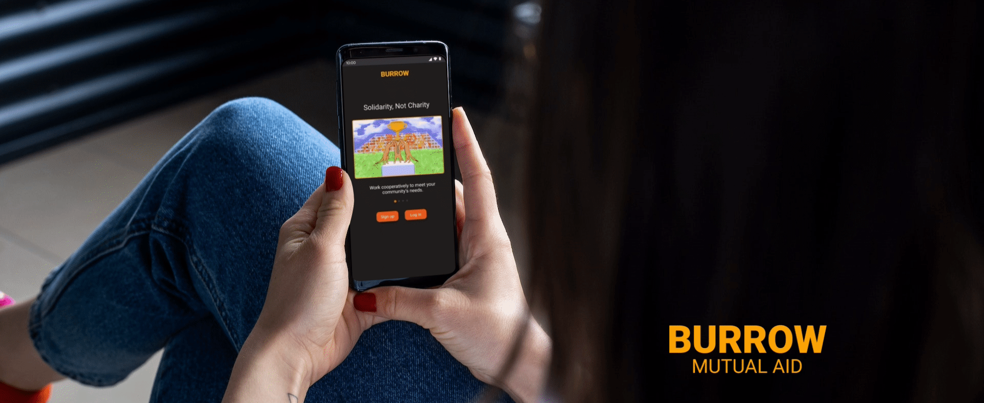
Product: Burrow (Mutual Aid App and Responsive Website)
Role: Digital Resource Designer (UI/UX, brand design, character illustration, motion design, copywriting)
Duration: Dec 2022-Jan 2023 (2 months)
Project Vision:
Burrow is a mobile app and responsive website that utilizes a virtual guide to help neighbors build credibility and solidarity in their communities through kind acts.
Challenges:
Introduce new users to the concept of mutual aid.
Design an intuitive community board that allows neighbors to post needs, offers, and local events.
Create a friendly and fun guide to to support users through challenging tasks.
Inspire confidence in the security of user information.
Kickoff
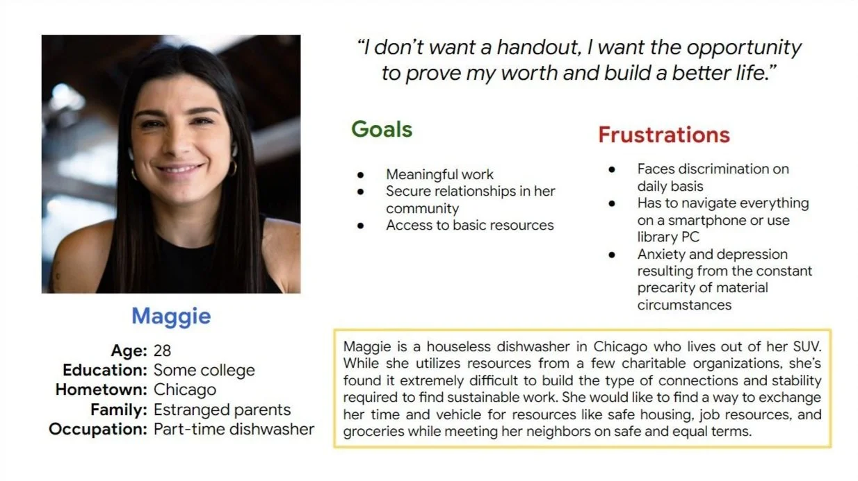
I began my research by conducting a round of short interviews with 8 community members to inform the creation of user personas their journey maps.

Competitive Analysis
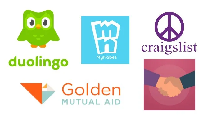
I then took a close look at three direct competitors: Golden, MyNabes, and MutualAid.
In addition, I analyzed Duolingo’s virtual guide feature and reviewed Craigslist’s bare bones approach to community listing boards.
Many features overlapped between competitors, but the main differences that I noticed were:
Easy vs. difficult to navigate
Fun vs. lifeless design
High vs. low engagement
Exclusive vs. inclusive voice
Pain Points
1
The concept of mutual aid is still unfamiliar to a lot of people, and is even viewed negatively by some.
2
Community board sites like Craigslist need strong search and filter features to function well.
3
Guides can slow the user flow and annoy users.
4
Users will be hesitant to post their personal information on an application they don’t trust.
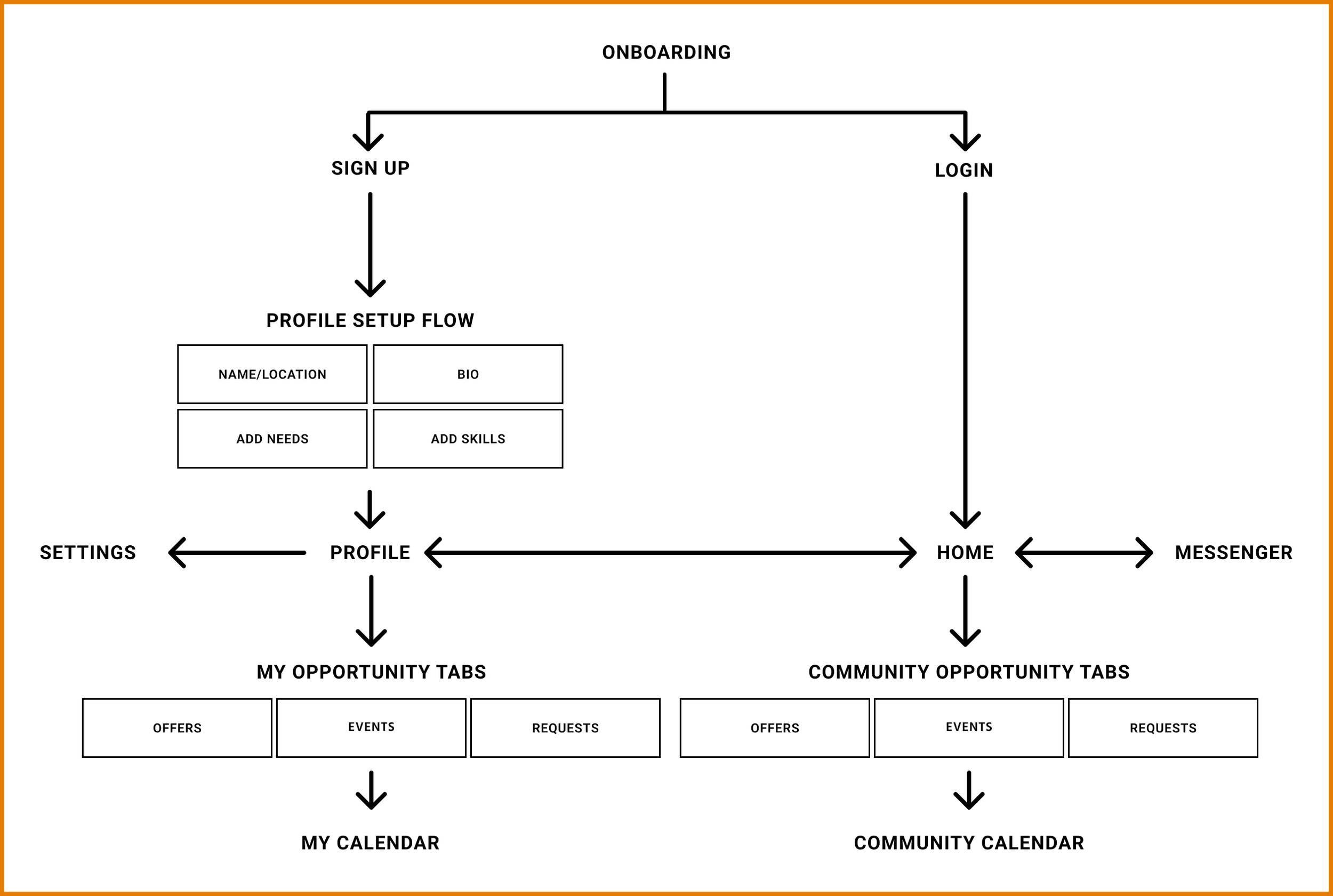
Information architecture
The app uses a co-existing hierarchy pattern.
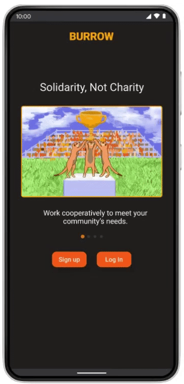
Users begin their journey at an onboarding slideshow page before signing up or logging in.
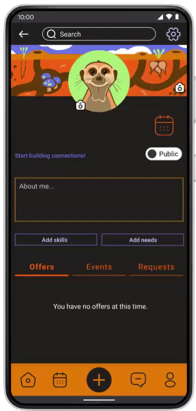
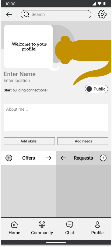
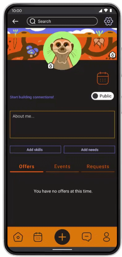
First time users are taken through their profile setup with a guide, while return users are navigated directly to the home page.
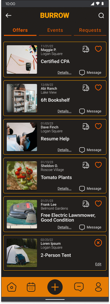
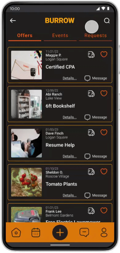
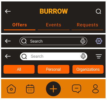
From the homepage, users can explore offers, events, and requests using a filter menu and search bar. Additionally, a navigation bar can quickly take users to their profile, calendar, or messages.
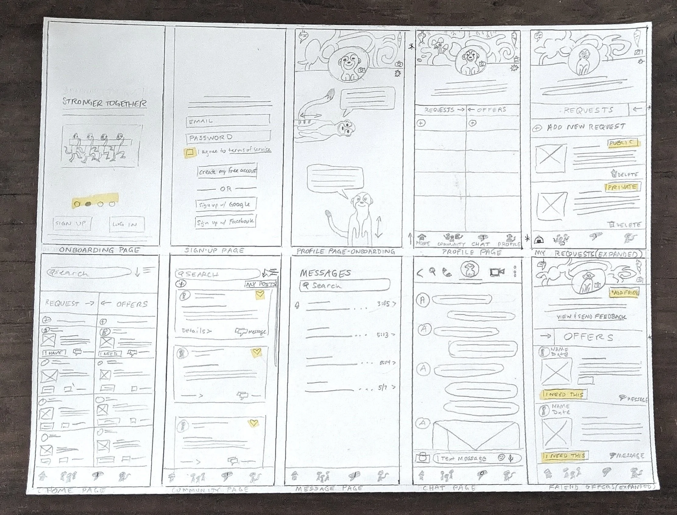
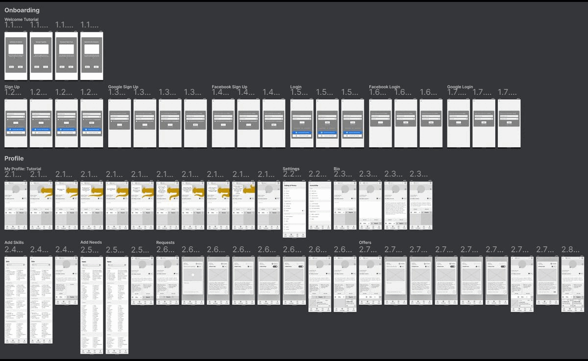
Wireframes
I started with some quick sketches, then digitized them in Figma.
First Iteration
Next, I created a prototype from low-fidelity wireframes and conducted an unmoderated usability study. Participants were asked to perform a number of critical tasks:
Sign up and build a profile.
Navigate to the home page and expand an event listing.
Request connection with the posting organization and share the event with a friend.
Navigate to requests page and post a public request.
Navigate to the messages page and ask Ameer where to find the accessibility settings.
A follow-up survey was used to assess problem areas for my next round of designs.
Usability Study Conclusions
Images or animations are better for explaining abstract concepts than words.
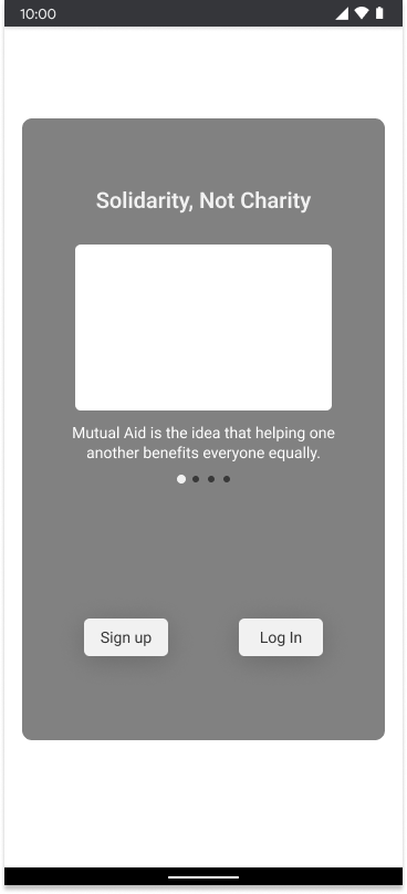
The onboarding flow needs some bright images that tell stories emphasizing the core ideas of mutual aid.
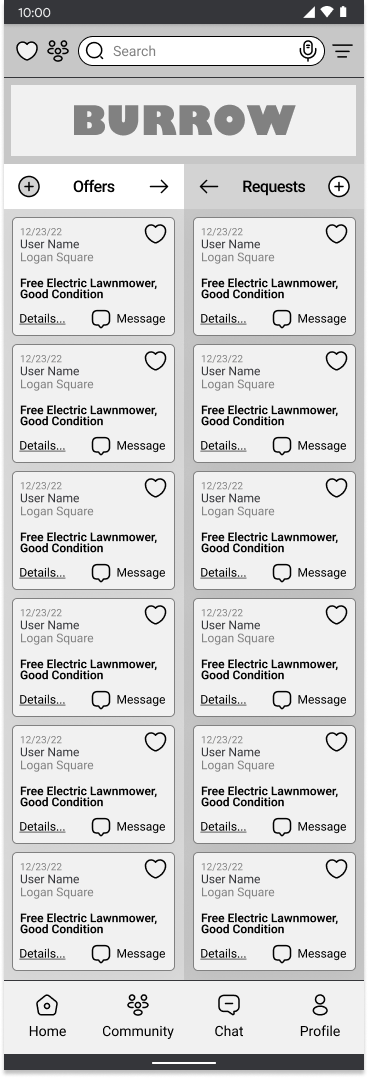
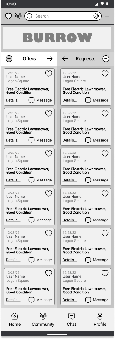
The homepage is too cluttered and community page is redundant.
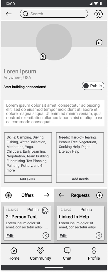
A tab category selector should be added to the profile and home pages so that offers and requests are displayed one at a time. A third category called “events” will replace the community page.
The guides interrupt the user flow too often and are annoying to some users.
Options should be created and highlighted to easily shut off the guides or ask for their assistance.
Users want the option to keep their location private and target their searches by distance.
A distance selector should be added to both the search bar and profile pages, and location won’t automatically display on user’s pages.
Mockups
Homepage before
Homepage after
Profile Walkthrough Before
Profile Walkthrough After
Hi-Fi Prototype
Challenge 1
Introduce new users to the concept of mutual aid.
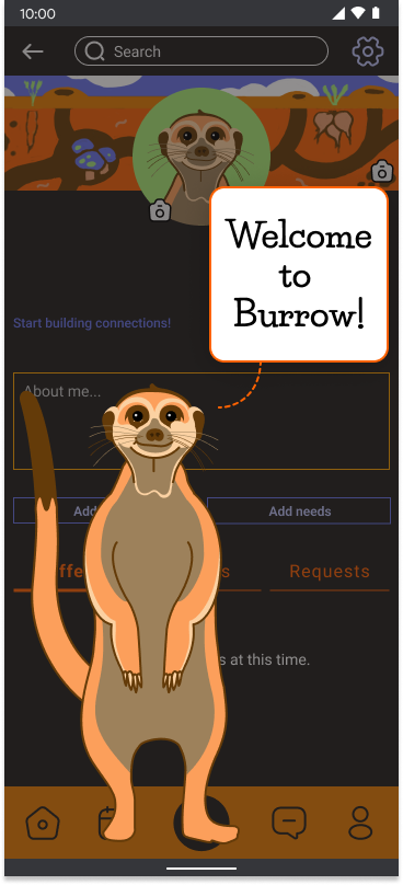
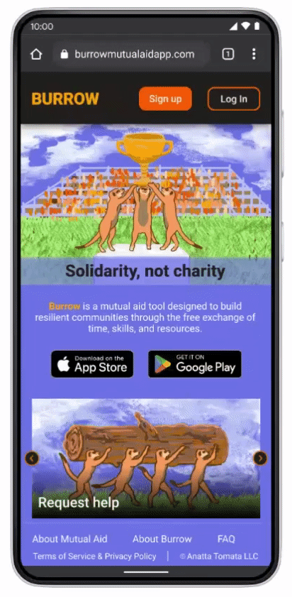
It can be difficult to quickly communicate complex ideas, but simple storytelling with images can break language barriers and inspire action.
The onboarding slideshow also provides some context for the meerkat guides that appear later in the user flow.
Challenge 2
Design an intuitive community board that allows neighbors to post needs, offers, and local events.
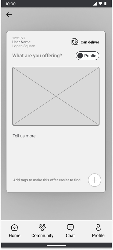
The new and improved homepage uses a three category tab selector so that users can quickly view offers, events, and requests. These lists can be filtered or sorted in a number of ways, can be added to a calendar, or shared with a friend.
Challenge 3
Create a fun and friendly virtual guide without significantly slowing the user flow or annoying users.
The new prototype uses quicker transitions between guide states, integrates profile selections within the tutorial, adds an on/off toggle for guides in the settings menu, and incorporates specific offers to disable certain repetitive messages.
Challenge 4
Users may be skeptical about sharing certain information with an application they don’t trust.
The app offers many options to make posts or profiles private. Location is never shared without permission, and a distance slider helps filter out opportunities that are too far away.
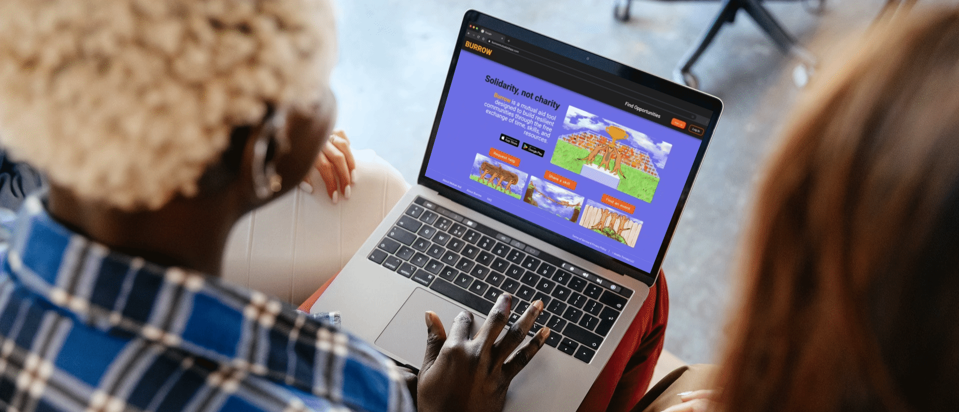
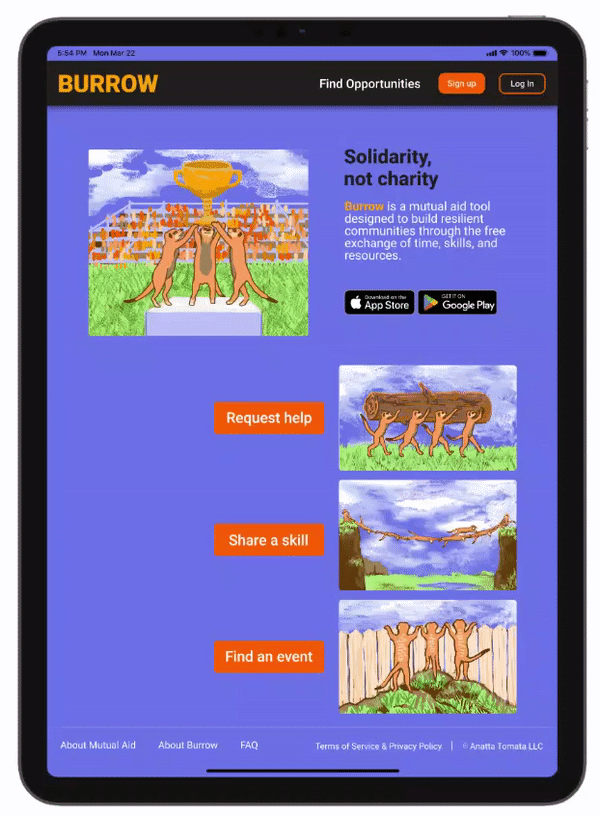
Responsive Website
To serve as many users as possible, I also designed a responsive website that places all of Burrow’s key features above the fold with additional buttons to download the app from Google Play or The Apple Store.
Brand Design
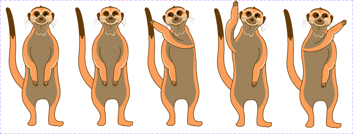
My virtual guides are a mob of meerkats, famous in the animal kingdom for their strong communities.

The series of tunnels they occupy are called burrows.

The brand name was selected to evoke feelings of privacy, interconnection, and home.
Guide Component States
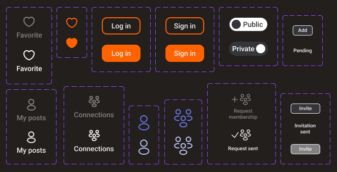
Style Guide


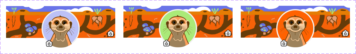
Default profile banner and avatars
Button component states
NEXT STEPS/Takeaways
As I researched Duolingo’s use of character to motivate users through challenging tasks, I also noted their use of gamification and digital rewards towards the same end. I’d like to explore these concepts further, and am especially excited about incorporating a custom merit badge builder so users can create and exchange tokens of gratitude to display on their profiles.
My current calendar flow needs additional attention- in particular I’d like to integrate a feature that allows users to mark off certain times they’re available and match users based on those opportunity windows.
Finally, I’d like to dig deeper into verification and social proof features that could help users build credibility and protect themselves from scams or harassment.
I had so much fun developing this product so far and would love to see it in action someday. I hope we learn how to work together better in the coming decades.
Thank you for your time and be sure to check out the process for Burrow’s creation below!